Main menu
You are here
CSS curved corners

In this tutorial , we will make css curved corners using a very easy and simple technique .
In the past , people used images to make a curved corners , but now we will make it without any image .
CSS curved corners
Let’s start how to make css curved corners :
First of all , I will make this HTML code :-
<!DOCTYPE html PUBLIC "-//W3C//DTD XHTML 1.0 Strict//EN" "http://www.w3.org/TR/xhtml1/DTD/xhtml1-
strict.dtd">
<html xmlns="http://www.w3.org/1999/xhtml" xml:lang="en">
<head>
<title>css curved corners</title>
<meta http-equiv="Content-Type" content="text/html; charset=UTF-8" />
<link media="screen" type="text/css" rel="stylesheet" href="css-curved-corners.css" />
</head>
<body>
<div id="curved-corner-example">
</div>
</body>
</html>
Ok , now we won’t change the HTML , we will just change the css code
Make a css file (I called it css-curved-corners.css)
and put this code in it :-
#curved-corner-example {
height: 400px;
width: 150px;
background: #81b6b7;
margin: 25px auto;
padding: 8px;
}
And you will have something like that :-

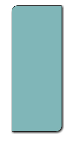
Ok , now we want to make curved corners , so just add this line into out css code
border-radius: 20px 20px 20px 20px;
and our CSS code will be :
#curved-corner-example {
height: 400px;
width: 150px;
background: #81b6b7;
margin: 25px auto;
padding: 8px;
border-radius: 20px 20px 20px 20px;
}
And it will be something like that
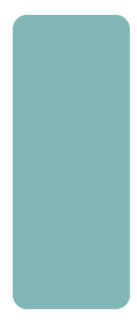
Ok now we want to make some changes , I want to curve some corners more than the others . so I’ll change the css code into this :
#curved-corner-example {
height: 400px;
width: 150px;
background: #81b6b7;
margin: 25px auto;
padding: 8px;
border-radius: 20px 2px 20px 2px;
}
As you see , 2 corners are curved with 20px radius , and the others are curved with 2px radius .
And it will be :-
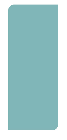
Finally , you can combine this technique with other techniques we used in previous lesson , I’ll combine it with shadow and border , so our code will be :-
#curved-corner-example {
height: 400px;
width: 150px;
background: #81b6b7;
margin: 25px auto;
padding: 8px;
border-radius: 20px 2px 20px 2px;
border-style:solid;
border-width:1px;
-moz-box-shadow: 3px 3px 10px #000;
-webkit-box-shadow: 3px 3px 10px #000;
box-shadow: 3px 3px 10px #000;
}
and the result :-
End of the tutorial :
This tutorial is exclusive for www.grook.net
In this tutorial we talked about css curved corners , and how to make them in an easy way
Thanks
Author : Ibrahim Kettaneh - CSS curved corners
Copyright© 2010-2012 Grook network
sitemap | Privacy Policy
Follow us on: 
