Main menu
You are here
Web Design Choosing Dimensions for Your Web Page Layout Tutorial
How to optimize your page layout to look great on a wide range of screen sizes. Discusses fixed and fluid widths, and "above the fold" content.

When designing a website, one of the early and crucial decisions you need to make is how it should fit onto the user's screen.
It's not as simple a decision as it may first appear. After all, users all have different sized monitors, and within that space, browsers may be sized in many ways — maximised, widescreen, or portrait, for example.
Your job, then, is to make sure your site fits elegantly into as many of these disparate environments as you can manage.
In this article, you'll look at:
- The choice between fluid and fixed-width page layouts
- Deciding on widths and heights, including the concept of "above the fold"
- Current best practice
First, a little history
Back before the world had heard of an iPod, shortly after dinosaurs became extinct, screens were very small, and we all had to design for the possibility that a site would have to display on a screen of 640 by 480 pixels.
Then, as screens became bigger, Web designers were all thrilled when we could start using 800x600 pixels as a reasonable starting point.
Nowadays, though, the situation's a little more complicated...
Fluid or fixed?
It's possible to make a page layout "stretch" to fit the width of any screen. So-called fluid layouts ensure that space on bigger screens is not wasted, while on smaller screens the page contracts fluidly to fit within the window.
There are downsides to a fluid layout though. On bigger screens your text will extend to fit the available area, resulting in line lengths that are harder to read. Also, your carefully created page composition, drawing the eye to the right points and giving an overall continuity to the design, will as likely as not be compromised as page elements move around the screen.
Within a fluid layout it's possible to fix the width of certain elements to preserve their integrity. As a commercial example, Amazon uses a fluid layout to good effect while fixing the left menu width.
» View a "bare bones" example of a fluid layout
The other option is to lock your page to a fixed width. This preserves composition and line length, improving legibility and navigation, but throws up the old problems about what size your site should be optimised for.
» View a "bare bones" example of a fixed-width layout
There is a further "hybrid" approach where some elements (often the header) are fluid and others remain fixed-width.
Deciding on widths and heights
Current received wisdom in corporate Web design is to optimise for screens that can display 1024x768 pixels. Bear in mind though that although your screen might have a resolution of 1024x768, the area you have to play with is usually much smaller. Once you've taken into account the task bar, browser buttons, scrollbars, Office bars, Google bars and all the other things that clutter up your screen, you can be left with very little space, especially on the vertical axis.
If a display is showing 1024 pixels across its width, you should allow for a certain amount of that to be taken up with a scrollbar, as well as the possibility of a task bar, office bar or dock. Allowing, say, 60 pixels for these elements gives you around 960 pixels as a "safe" width. 980 pixels is probably the maximum.
For vertical space, you can assume 500-600 pixels to be above the fold. This was originally a newspaper term, but here it signifies the initial visible area before the user has to scroll down. It's important to realise though that the exact location of the "fold" is a movable feast, and is dependant on the user's screen size.
The popular "netbook" size of computer often has a screen displaying only 1024x600 pixels, which means a usable vertical space before scrolling of only maybe 400 pixels.
The current vogue in Web design is to put only the vital elements in this "above the fold" area, so as to maximise exposure for these really important parts of the design and thus simplify browsing for the bulk of users. Some vertical scrolling is okay though, with diminishing importance placed on content further down the page.
» View an example of "above the fold" content
(The above page has a promo area and an overlay showing the "above the fold" area. Click the link in the page to show the overlay.)
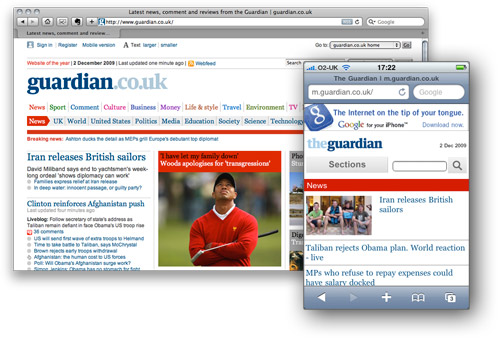
Mobile devices
Finally, a word about mobile devices. More and more people are now using their phones to browse the Web, especially those with the Apple iPhone, which has a screen size of only 480x320 pixels.
The iPhone can browse normal Web pages, but it's still nice to create specific presentations of your site for the iPhone and other platforms if that's important to your audience. Using CSS you can cleanly separate your content from the page layout, making it easy to create different layouts for different devices.
Copyright© 2010-2012 Grook network
sitemap | Privacy Policy
Follow us on: 
