Main menu
You are here
9 Most Common IE Bugs and How to Fix Them
Internet Explorer – the bane of most web developers’ existence. Up to 60% of your development can be wasted just trying to squash out IE specific bugs which isn’t really a productive use of your time. In this tutorial, you are going to learn about the most common IE bugs and rendering disparities and how to easily squash them or deal with them. Interested? Let’s get started.
1. Centering a Layout
Centering an element is probably something every web developer has to do while creating a layout. The easiest and most versatile way to center an element is to just add margin: auto; to the relevant element. The above method will take care of centering the element irrespective of the resolution and/or browser width. IE 6 in quirks mode however decides to handle this in the most unfortunate way possible: by not handling it at all.
Consider the Following Code:
- #container{
- border: solid 1px #000;
- background: #777;
- width: 400px;
- height: 160px;
- margin: 30px 0 0 30px;
- }
- #element{
- background: #95CFEF;
- border: solid 1px #36F;
- width: 300px;
- height: 100px;
- margin: 30px auto;
- }
#container{
border: solid 1px #000;
background: #777;
width: 400px;
height: 160px;
margin: 30px 0 0 30px;
}
#element{
background: #95CFEF;
border: solid 1px #36F;
width: 300px;
height: 100px;
margin: 30px auto;
}
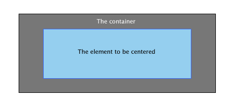
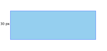
The output you’d expect:
But what IE actually gives you:
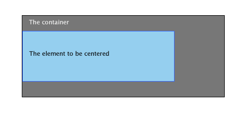
This is mainly due to IE6 in quirks mode and below not recognizing the auto value we set to the margin property. Fortunately, this is easily fixed.
The Fix
The easiest and most reliable way to center content for IE6 and below is to apply text-align: center to the parent element and then apply text-align: left to the element to be centered to make sure the text within it is aligned properly.
- #container{
- border: solid 1px #000;
- background: #777;
- width: 400px;
- height: 160px;
- margin: 30px 0 0 30px;
- text-align: center;
- }
- #element{
- background: #95CFEF;
- border: solid 1px #36F;
- width: 300px;
- height: 100px;
- margin: 30px 0;
- text-align: left;
- }
#container{
border: solid 1px #000;
background: #777;
width: 400px;
height: 160px;
margin: 30px 0 0 30px;
text-align: center;
}
#element{
background: #95CFEF;
border: solid 1px #36F;
width: 300px;
height: 100px;
margin: 30px 0;
text-align: left;
}
2. Staircase Effect
Almost every web developer uses lists to create his navigation. Usually, you create the container element, create some links inside and then float the anchors in the direction he wants and calls it a day. Usually. IE though decides to make it a lot more complicated. Peruse through the following code:
- <ul>
- <li><a href="#"></a></li>
- <li><a href="#"></a></li>
- <li><a href="#"></a></li>
- </ul>
<ul>
<li><a href="#"></a></li>
<li><a href="#"></a></li>
<li><a href="#"></a></li>
</ul>
- ul {
- list-style: none;
- }
- ul li a {
- display: block;
- width: 130px;
- height: 30px;
- text-align: center;
- color: #fff;
- float: left;
- background: #95CFEF;
- border: solid 1px #36F;
- margin: 30px 5px;
- }
ul {
list-style: none;
}
ul li a {
display: block;
width: 130px;
height: 30px;
text-align: center;
color: #fff;
float: left;
background: #95CFEF;
border: solid 1px #36F;
margin: 30px 5px;
}
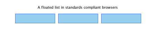
A standard compliant browser renders it like so:
And the IE screen shot:
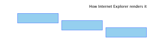
Not a particularly pleasing navigation if you ask me. Fortunately, there are 2 fixes you can try.
Fix #1
The easiest way to combat this is to float the li elements themselves instead of the anchor elements. Just add this and you should be done.
- ul li {
- float: left;
- }
ul li {
float: left;
}
Fix #2
The second way is to apply display: inline to the enclosing li element. In addition to fixing this bug, it also fixes the double margin bug mentioned below. Purists may not like placing block elements inside inline elements though.
- ul li {
- display: inline
- }
ul li {
display: inline
}
3. Double Margin on Floated Elements
This bug is probably among the first ones a web developer starting out will run into and is specific to Internet Explorer 6 and below. Triggering it is as simple as floating an element and then applying a margin in the direction it has been floated. And voila! The margin will be doubled in the rendered output. Not really something you’d look forward to while creating a pixel perfect layout.
Consider this code:
- #element{
- background: #95CFEF;
- width: 300px;
- height: 100px;
- float: left;
- margin: 30px 0 0 30px;
- border: solid 1px #36F;
- }
#element{
background: #95CFEF;
width: 300px;
height: 100px;
float: left;
margin: 30px 0 0 30px;
border: solid 1px #36F;
}
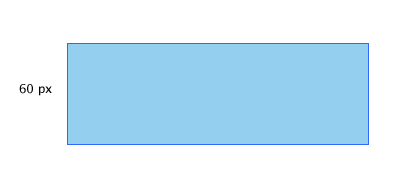
On standards compliant browsers, this is how it looks:
But here is how IE 6 decides to render it:
The Fix
The fix for this specific bug is to apply display: inline to the floated element and everything works as it is supposed to. Our previous code now changes to:
- #element{
- background: #95CFEF;
- width: 300px;
- height: 100px;
- float: left;
- margin: 30px 0 0 30px;
- border: solid 1px #36F;
- display: inline;
- }
#element{
background: #95CFEF;
width: 300px;
height: 100px;
float: left;
margin: 30px 0 0 30px;
border: solid 1px #36F;
display: inline;
}
4. Inability to Have Elements with Small Heights
As part of creating a layout, you may need to create elements with very small heights as custom borders for elements. Usually, you’ll just have to add height: XXpx to the style’s declarations and you should be done. Or so you thought. Check the page in IE and you’ll probably do a double take.
As an example, look at the following code:
- #element{
- background: #95CFEF;
- border: solid 1px #36F;
- width: 300px;
- height: 2px;
- margin: 30px 0;
- }
#element{
background: #95CFEF;
border: solid 1px #36F;
width: 300px;
height: 2px;
margin: 30px 0;
}
And the output is just as expected: A 2 px element with a 1 px border.
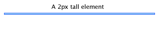
And in IE:
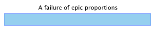
Fix #1
The cause of this bug is pretty simple: IE simply refuses to size an element smaller than the set font size. Simply setting the font size to 0 lets you have an element as small and short as you like.
- #element{
- background: #95CFEF;
- border: solid 1px #36F;
- width: 300px;
- height: 2px;
- margin: 30px 0;
- font-size: 0;
- }
#element{
background: #95CFEF;
border: solid 1px #36F;
width: 300px;
height: 2px;
margin: 30px 0;
font-size: 0;
}
Fix #2
The next best way to deal with this bug is to apply overflow: hidden to the element so it collapses to the intended height.
- #element{
- background: #95CFEF;
- border: solid 1px #36F;
- width: 300px;
- height: 2px;
- margin: 30px 0;
- overflow: hidden
- }
#element{
background: #95CFEF;
border: solid 1px #36F;
width: 300px;
height: 2px;
margin: 30px 0;
overflow: hidden
}
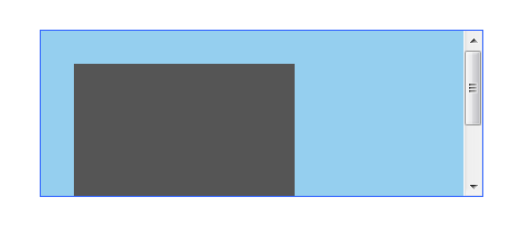
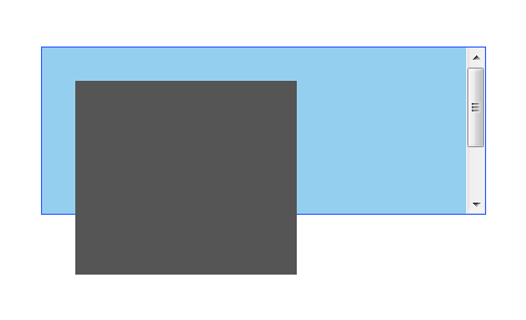
5. Auto Overflow and Relatively Positioned Items
This bug rears its ugly head when in a layout you set the parent container’s overflow property to auto and place a relatively positioned item inside it. The relatively positioned item violates its parent element’s boundaries and overflows outside. Let me demonstrate. Look the following code:
- <div id="element"><div id="anotherelement"></div></div>
<div id="element"><div id="anotherelement"></div></div>
- #element{
- background: #95CFEF;
- border: solid 1px #36F;
- width: 300px;
- height: 150px;
- margin: 30px 0;
- overflow: auto;
- }
- #anotherelement{
- background: #555;
- width: 150px;
- height: 175px;
- position: relative;
- margin: 30px;
- }
#element{
background: #95CFEF;
border: solid 1px #36F;
width: 300px;
height: 150px;
margin: 30px 0;
overflow: auto;
}
#anotherelement{
background: #555;
width: 150px;
height: 175px;
position: relative;
margin: 30px;
}
And the expected output:
google_protectAndRun("ads_core.google_render_ad", google_handleError, google_render_ad);
And IE’s output:
The Fix
The easiest way to fix this annoying bug is to just position the parent element relatively too.
- #element{
- background: #95CFEF;
- border: solid 1px #36F;
- width: 300px;
- height: 150px;
- margin: 30px 0;
- overflow: auto;
- position: relative;
- }
#element{
background: #95CFEF;
border: solid 1px #36F;
width: 300px;
height: 150px;
margin: 30px 0;
overflow: auto;
position: relative;
}
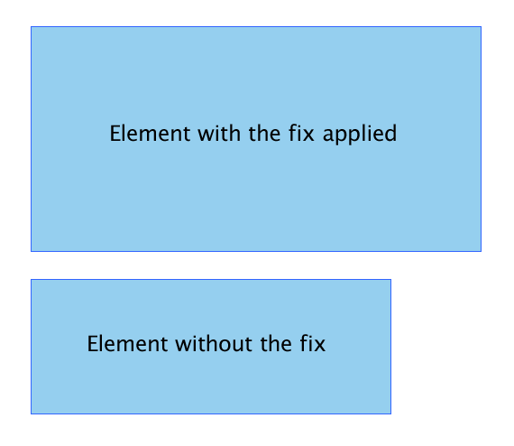
6. Fixing the Broken Box Model
Internet Explorer’s misinterpretation of the box model is perhaps its unforgivable mistake. IE 6 in semi-standards compliant mode sidesteps this but this issue can still be triggered by quirks mode.
Two div elements. One with the fix applied and one without. The difference in the width and height is the sum of the paddings applied on each side.
The Fix
I am sure the quandary with the box model needs neither explanation nor demonstration so I’ll just give you the fix.
The trick is to set the width normally for all standards compliant browsers, target IE5/6 alone and then feed it the corrected width. This is how you’d usually go on about:
- #element{
- width: 400px;
- height: 150px;
- padding: 50px;
- }
#element{
width: 400px;
height: 150px;
padding: 50px;
}
This now changes to:
- #element {
- width: 400px;
- height: 150px;
- \height: 250px;
- \width: 500px
- }
#element {
width: 400px;
height: 150px;
\height: 250px;
\width: 500px
}
Essentially, you add the padding to the original width and feed it to IE 6. The fix targets IE 6 in quirks mode alone so you need not worry about IE 6 in normal mode messing things up.
7. Setting a Minimum Width and Height
Setting an minimum height to an element is absolutely imperative when trying to convert a beautiful design into a pixel perfect design. Unfortunately, IE completely ignores the min-height property instead taking the height declared as the minimum height.
Fix #1
The fix is a hack created by Dustin Diaz. It utilizes the !important declaration to make it work. The snippet looks like so:
- #element {
- min-height:150px;
- height:auto !important;
- height:150px;
- }
#element {
min-height:150px;
height:auto !important;
height:150px;
}
Fix #2
The second way is to take advantage of the fact that IE can’t parse child selectors.
- #element {
- min-height: 150px;
- height: 150px;
- }
- html>body #element {
- height: auto;
- }
#element {
min-height: 150px;
height: 150px;
}
html>body #element {
height: auto;
}
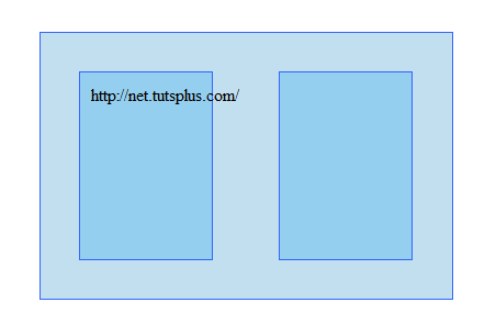
8. Floated Layout Misbehaving
One of the important concepts of building table-less layouts using CSS is floating elements. In most cases, IE6 handles this with aplomb but in certain cases it fumbles. When faced with unbreakable content or elements whose width exceeds its parent’s width, it causes havoc with the layouts. Let me show you.
Consider this piece of code:
- <div id="container">
- <div id="element">http://net.tutsplus.com/</div>
- <div id="anotherelement"></div>
- </div>
<div id="container">
<div id="element">http://net.tutsplus.com/</div>
<div id="anotherelement"></div>
</div>
- #element, #anotherelement{
- background: #95CFEF;
- border: solid 1px #36F;
- width: 100px;
- height: 150px;
- margin: 30px;
- padding: 10px;
- float: left;
- }
- #container{
- background: #C2DFEF;
- border: solid 1px #36F;
- width: 365px;
- margin: 30px;
- padding: 5px;
- overflow: auto;
- }
#element, #anotherelement{
background: #95CFEF;
border: solid 1px #36F;
width: 100px;
height: 150px;
margin: 30px;
padding: 10px;
float: left;
}
#container{
background: #C2DFEF;
border: solid 1px #36F;
width: 365px;
margin: 30px;
padding: 5px;
overflow: auto;
}
The expected output as viewed on a standards compliant browser:
In IE:
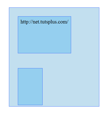
As you can see, the first div expands itself to fit the content which ultimately breaks the layout.
The Fix
There is no elegant fix for this bug. The only way to save the layout is to apply overflow: hidden to the element but at the cost of clipping the unbreakable content. The layout will be saved but the extra content won’t.
- #element{
- background: #C2DFEF;
- border: solid 1px #36F;
- width: 365px;
- margin: 30px;
- padding: 5px;
- overflow: hidden;
- }
#element{
background: #C2DFEF;
border: solid 1px #36F;
width: 365px;
margin: 30px;
padding: 5px;
overflow: hidden;
}
9. Space Between List Items
IE 6 adds vertical spacing even none is specified in specific cases. Let’s look at the code first.
- <ul>
- <li><a href="#">Link 1</a></li>
- <li><a href="#">Link 2</a></li>
- <li><a href="#">Link 3</a></li>
- </ul>
<ul>
<li><a href="#">Link 1</a></li>
<li><a href="#">Link 2</a></li>
<li><a href="#">Link 3</a></li>
</ul>
- ul {
- margin:0;
- padding:0;
- list-style:none;
- }
- li a {
- background: #95CFEF;
- display: block;
- }
ul {
margin:0;
padding:0;
list-style:none;
}
li a {
background: #95CFEF;
display: block;
}
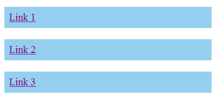
What it should look like:

What IE gives us:
Fortunately, there are a plethora of fixes you could try.
Fix #1
The easiest way out is to just define a width for the anchor tags and voila! everything renders as it should. Declaring a width triggers the element’s IE specific hasLayout property. You could instead define a height if you want to.
- li a {
- background: #95CFEF;
- display: block;
- width: 200px;
- }
li a {
background: #95CFEF;
display: block;
width: 200px;
}
Fix #2
The next method is to just float the anchor left and then clearing it.
- li a {
- background: #95CFEF;
- float: left;
- clear: left;
- }
li a {
background: #95CFEF;
float: left;
clear: left;
}
Fix #3
The third method is to add display: inline to the enclosing li element. This also fixes the double margin bug as noted above.
- li {
- display: inline;
- }
-
Source :
tutorialized.com
li {
display: inline;
}
Copyright© 2010-2012 Grook network
sitemap | Privacy Policy
Follow us on: 
